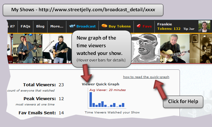
New Feature: Viewer Quick Graph
User Type: Musicians
How to Find: Click on main menu Down Arrow ∇, choose My Shows, click show Id link
We created the “Viewer Quick Graph” for musicians to get a better feel of how long viewers are watching their StreetJelly broadcasts. Unlike a concert where a patron would purchase a ticket to a show, broadcasting on StreetJelly is more like performing open mic in a cafe or busking on the street corner for coin. People will come and go continuously during the performance for many different reasons. But unlike in the real world, we now report to the musicians how long viewers were connected to their stream.
The graph is not a reflection of one’s musical skills, but merely shows the flow of viewers in and out of a performance. The free-to-view nature of StreetJelly, and the internet in general, encourages visitors to pop in and check out as many musicians as possible. But at the same time, die hard fans will flock to a favorite musician and watch an entire show. The graph shows this relationship of time-spent-in-a-show.
We call it a “quick” graph because its the visual pattern of the graph, and not necessarily the values of each bar, that quickly gives the musician the visual cue of how long viewers stayed. But first, let’s explain those bars. We divide the duration of your show into twelve time increments represented by each bar (the x-axis). For example: in a 1-hour show, the 1st bar represents 5 minutes, the 2nd bar 10 minutes, 3rd bar 15, and so on. For a 2-hour show, each bar then represents 10 minutes, 20, etc. Next, the height of each bar (the y-axis) shows how many people watched your show for that length of time. On the actual graph, hover over each bar with your mouse to see the data values.
 The less time people stay connected to your stream, they will be counted in bars on the left side. The longer time they stay, they will be collected in the right side bars. For example, all the bars stacked to the left means most everyone left after a short time, while all the bars stacked to the right mean most people stayed for the entire show. But remember, the timer for a viewer starts counting whenever they arrive. If a viewer arrives late at the end of a set, then their viewing time would naturally be a fraction of the total length of the show. That late viewer would be represented in the bars on the left.
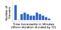
Ok, now that we thoroughly confused everyone, let’s take a look at some sample graphs to put this all together:
 Most shows will have a nice spread of viewers who stay for various lengths. But you will always have many viewers that pop in for a very short time, hence the large bar on left.
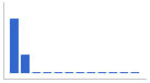 We call these the “busy body” viewers who can’t sit still. These people are bouncing around the site, checking out multiple shows, making dinner on the side, and not able to stay long.
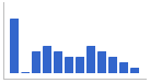
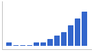 Here we see our favorite couch potatoes. Most people stuck around for much of the show. The musician has managed to capture and entertain their crowd for a nice long time.
 This is a special case when either the show is less than 12 minutes long (remember we divide the bars up in 12 time increments); or you are looking at a show way back in time before we collected viewing time information (back in 2013).
The Viewer Quick Graph is a marketing tool for StreetJelly musicians. Use it to understand what your viewers are doing, how they respond to your performance, and how to improve fun for everyone. Got any performance tips about increasing viewership? Add them in the comments below…